If you are a beginner or hobby-ist artist looking to start testing the waters with your art, the first suggestion anyone will give you is to post everything onto a website. The only problem is, most websites these days are geared towards fledgling professionals - recent grads, freelancers, etc. These websites are generally geared towards the demographic that already has some established income or can anticipate having established income in art. However, for a young artist who hasn't made their first sale yet, how do you test the waters?
Look no further- we've done all the muddy digging for you. While we haven't fully tested out the sites yet ourselves (that will come at a later post), we've dabbled and and done our thorough research. All of the suggestions below are not only free, but also ad-free! Sweet! That's already better than the free plan at Wordpress. (Granted, you will have to add the website's name after yours, but that's a given - and still better than the free plan at Wordpress!)
1. Portfoliobox.net
At the top of our list, there is Portfoliobox. Lush, modern, dynamic, it's a heavy-hitter for free portfolios sites. Boasting a highly customizable dashboard of all sorts of goodies, Portfoiobox is the Squarespace for aspiring artists looking to take their first steps in posting an online portfolio. Even if you are a hobbyist artist, your website at least will look super professional, and you'll also have an opportunity to play around with more settings than can be found on other "pro" websites.
PROS: Free - 10 products, 30 images, 10 pages, aesthetically beautiful and professional, highly customizable. Excellent website to add on blogs, comment section, etc.
CONS: Watch out when selecting your choices - many are “locked” unless you upgrade. That being said, there are still quite a lot of selection for those that are available for free.
2. Crevado
Where Portfoliobox has all the bells and whistles, Crevado is the opposite. Don't let the bold simplicity take you off-guard though. Crevado's strength is that it is truly simple and straightforward, with an easy drag-and-drop interface. Although more limited in what you are able to do (less pages), it can have the functional look of the late 90s/early 2000s, and is also unapologetically authentic, easy for the artist to use, and (most importantly) clear for the viewer to understand. If you don't have time to play around with all of Portfoliobox's shiny toys, go Crevado.
PROS: Free - 5 galleries, 30 images, 2 pages, simple and straightforward, drag-and-drop interface.
3. FolioDropPROS: Free - 5 galleries, 30 images, 2 pages, simple and straightforward, drag-and-drop interface.
CONS: Limited pages, very “functional”.
Not interested in fiddling around too much but wanting something cleaner? FolioDrop is your best option. With a much larger allowance for photos and unlimited pages, your portfolio can be super varied. It has a lovely drag and drop interface as well. The only issue is - there is only 1 template you can choose from, which means your portfolio will look exactly like all the others on the free account.
PROS: Free - 80 images, 3 categories, unlimited pages, drag and drop interface, aesthetically beautiful and professional
CONS: 1 template only (“Classic”, black/white)
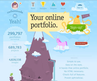
Looking for something with a little more personality? Go Carbonmade. Super-cute and direct, it gets straight to the nitty-gritty. Compared to Portfoliobox, it's relatively customizable, with a nice selection of different templates for you to choose from. If you use Tumblr, Carbonmade's dashboard will be a bit familiar...just without all the glitching and bugging. It already comes with an About Me and a Contact page built in, so you don't have to waste Pages making those sections from scratch. The Contact page even has a message box all built-in for you!
BONUS: Carbonmade also has a "network pool" wherein employers can reach out to you about your talent. The dashboard comes with a messaging service that will notify you when someone is interested in hiring you. Awesome!
PROS: Free (automatic “Meh” Plan) - 5 projects, 35 images, very simple, relatively customizable, very cute
CONS: Very cute, very hip. Targets a particular demographic. Dashboard may not be what you expect if you haven't used Tumblr before.
With every device having screens of different sizes, having a site that is responsive is key. This is SlidingBoxes' biggest strength, although all the other portfolios are somewhat outfitted for mobile use. Like FolioBox, it is super clean and minimalist, but you are even more limited with your customization choices.
PROS: Free - 5 projects, 35 images, (3 pages?) super clean, polished and minimalist, responsive
CONS: very little customization choice
So those are our 5 top choices! Personally, if you're looking to get the most experience out of your beginner's portfolio, I would recommend Portfoliobox and Carbonmade. Both of these two sites have much more customization choices and have connections to an established community of artists and talent scouts. If you're looking to just start off with simply a gallery to show, I would go with Crevado, FolioBox or SlidingBoxes.
We hope this helped! Which website host do you all use? Let us know in the comments below, and stay tuned to our Top 5 Portfolio Website List - for Intermediate Artists!
We hope this helped! Which website host do you all use? Let us know in the comments below, and stay tuned to our Top 5 Portfolio Website List - for Intermediate Artists!
----
KeenArt Media is an online fine art printing and framing company, specializing in canvas, archival and photographic prints and reproductions. We are proud to serve and support artists from all over Canada.
KeenArt Media Ltd. Toll Free: 1-888-533-6278


No comments:
Post a Comment