Showing posts with label drawing. Show all posts

Wednesday, June 14, 2017

Marketing Yourself - Artist Youtube Star Katie Jobling

Hello everyone!

We know it's hard to make it as an artist, especially if you're still young and haven't broken into the world of fine-art gallery networking. While the internet has opened up more opportunities for us, it has also flooded the ability for everyone to start posting and promoting. That's why we're sharing a few tidbits from some of our favorite self-starter artists who are excellent at using social media to promote themselves - from Facebook to Instagram to Youtube.

For today's session, we're featuring an artist who uses Youtube as their main channel (pun not intended) to develop a loyal following, community and feedback. Please meet Katie Jobling, a graphic designer-turned-artist from across the seas. Katie is one of those rare and lucky individuals who were able to make the complete leap into doing art full-time, leaving behind their creative 9-5 job for full artistic freedom. In addition to doing tutorials and sharing her knowledge, she also ships and handles her own prints from an Etsy shop and Instagram site.
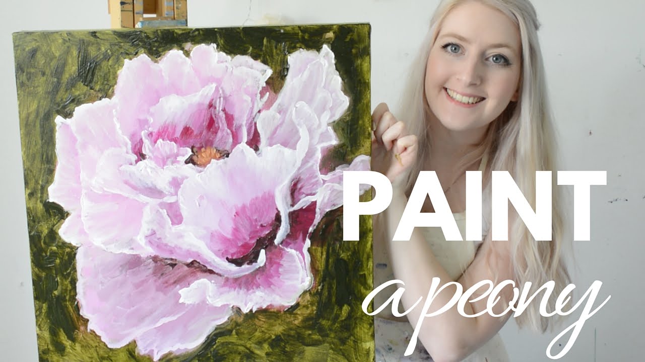


One of Katie's hugest contributions to her followers (we believe) is her calming and easy-to-follow tutorials. She is able to express her wealth of knowledge in a manner that is approachable, kind, and self-forgiving. When watching her videos, the most complicated steps can seem so simple, and the simplicity and softness in her teaching approach is inspiring. Watch her Youtube videos here:


She also does great video sessions on her own experiences with selling, pricing, and building her business from her art:


From her videos, it's easy to see how quick one can fall in love with her artistic "brand" as it were. She is soft-spoken and sweet, encouraging and peaceful. She's also relatable, as shown through her supporting vlogs. Although one watches the videos for Katie Jobling's art, soon one stays for the inspirational artist they may become.

That ends our first session of Marketing Yourself series! What did you think of the videos? Any Youtube stars you are a fan of and would like us to feature? If so, leave a message in the comments below!

---

KeenArt Media is an online fine art printing and framing company, specializing in canvas, archival and photographic prints and reproductions. We are proud to serve and support artists from all over Canada. 

KeenArt Media Ltd. Toll Free: 1-888-533-6278 (KeenART)
www.CanadaOnCanvas.com 
Working Hours: Pacific Standard Time
8:30 AM to 5:00 PM Monday to Thursday
8:30 AM to 4:00 PM Friday

Friday, May 27, 2016

5 Great apps to edit your photo!

It has become very common for people to take photos with their cellphone. In fact, it's a mainstream that we take photos with our phone and share with friends and public online via social network such as instagram and facebook.

Today, we like to introduce some great apps that will enhance your photos.

1. VSCO - iOS / Android

VSCO is well known for its unique film preset that can be used on desktop software, and now they have packed its core into an awesome editing app that can be used on your mobile. The filters are amazing, and you can adjust them to your taste. The app is free which comes with basic filters, and you can purchase more filters within the app.

2. Adobe Lightroom - iOS / Android

Adobe has improved their standing in mobile standing as the app provides powerful editing which can sync to the desktop with Adobe CC. With Adobe Photoshop Express, they make a great editing combo for serious mobile photographers.

3. Pixlr - iOS / Android

Introducing over 2 million combinations of effects and filters, this app offers layers, text captions and collage options. Considering it is free, this app has all you need.

4. Snapseed - iOs / Android

Snapseed offers great set of tools that can transform your photo with ease. You can make selective adjustments and even healing tool to remove unwanted objects in your photos. The app also offers set of filters that can enhance your photo instantly. It is one of the must-have apps if you are into photography.

5. Mextures - iOS

Mextures offers range of textures, grains and light leaks that can be overlayed easily with your control onto your photos. If you want to achieve another level of creative editing, this app may be the right one to start with.


After editing your photos, you may want to bring them out of screen and have them as prints. In that case, visit www.canadaoncanvas.com where they offer great pricing with great quality products to keep your precious moments for a long time.

Tuesday, May 17, 2016

How to preserve your art


How to preserve your art

The Gallery HQ Wallpaper
http://hqwallbase.pw/71344-the-gallery/

It is pretty common in these days that having art reside within the screens for viewing and displaying. However, the screens cannot exactly reproduce thick textures of the paints or the genuine gestures built within the work of masters, so that is why we keep going back to the museums and galleries and see the original work with our eyes.

But, when we get to the place to look at the original work and see that it no longer holds its form but slowly deteriorating, only thing that is left would be our disappointments and loss of precious legacy.

To prevent such calamities as much as possible, we will go over several things to watch out for when handling an original artwork and how to keep the work protected for a long time.

There are many factors that will accelerate the deterioration of an artwork. Such as;

http://www.bet.com/content/dam/betcom/images/2013/07/National-07-16-07-31/071913-national-heat-wave-window-sunlight-energy-conservation.jpg.custom1200x675x20.dimg
UV rays - mostly from natural light such as the sun - will change the colors of ink to fade quickly and even discolor the paper. It would be a shame to see a limited edition of a beautiful painting lose its vibrant colors because it was left in a constant sunlight. To avoid such problem, use an UV light filter glazed glasses with anti-glare coating when framing a work to limit the UV infiltration as much as possible while keeping the reflections minimal for the best look. Also, avoid  hanging an artwork in places such as near a heat source or opposite side of the window where direct light is constantly reaching.


http://www.greenhomeinspections.net/images/moisture1.jpg
Moisture - water is another huge factor that ruins an artwork because not only it crumbles or stains the paper, it accelerates the chemical reactions in materials. So it is critical to maintain the right environment when the work is placed. It is advised to keep the temperature around 20 degrees Celsius (room temperature) and humidity level around 50%. Keep in mind  fluctuation of conditions will accelerate the deterioration process as well, so it is never enough to emphasize that keeping the environment in a steady condition is crucial protection for an artwork. Try to avoid places such as washrooms and basement where humid can build up easily.


https://s3.amazonaws.com/arsenal-s3.gomedia.us/wp-content/uploads/gma-texture-collection-05-dust-pack-01-hero-shot-rev-01.jpg
Dusts and dirt - dusts and dirt are another factor that destroy a beautiful work. So we recommend having some sort of backing for the work to keep the small things enter into the work. If you find the work really precious, you may want to consider add several backings to ensure the work is well protected.


http://www.montel.com/images/Museums_Art_Racks_Storage_04.jpg
Pests - insects and rodents tend to eat away your work - papers and canvases. Always keep your environment and storage areas clean and do not leave any  food or beverages near by which can draw the pests. Check and monitor the area regularly to ensure the space is kept secured.


One more thing to note is that, if you are displaying or storing an original  work or special prints, it is highly  recommended to use archival materials to guarantee protection from acids damaging your precious work over time.

If you are having trouble to find the right materials you need to protect your precious artwork, or you would like to have all-in-one package with your work printed in quality material, please visit www.canadaoncanvas.com. You can just order the pieces you need or we can print, arrange and assemble all together and ship to your door.

Friday, May 6, 2016

Color 101 - Let's talk about colors!

Color 101

There are many terms regarding colors, however, since we are in color theory 101, lets just take a look at the basic terms that are key to understand how color is used.

http://cdn2.hubspot.net/hubfs/53/123b.png?t=1462568073767

primary colours - red, blue and yellow
secondary colours - second set of colors mixing 2 primary colors - green, purple and orange
tertiary colours - third set of colors mixing 1 primary color and 1 secondary color

hue - a pure color without any white or black
shade - a pure color mixed with black to produce darker color
tint - a pure color mixed with white to produce lighter color
tone/saturation - intensity of color - higher saturated color will be much vivid and stronger.

Once you have understood different properties of color, let's take a look at how each color is often described as, in other words, color psychology.

Colors describe certain feelings or characteristics which become a tool that advise the viewers how to approach and understand the subject.


red - powerful and strong color, often associated with meanings such as wild, power, strength, passion, danger, and anger.


blue - one of the most common colors in our lives which describes calmness, trust, peace, sadness, and intelligence.


yellow - energizing color as it is often associated with sun and light. Also it describes warmth and joy


green - often refers to nature, new, optimisim and harmony. Also, it describes envy and jealousy.


orange - another energetic color that stands out and attract attention. The color signifies autumn and harvest as well.


purple - very prominent color that signifies royalty and wealth. Sometimes they represent other things such as death, imagination and romance.


white - often described as the color of purity, perfection, and peace. (One of the reasons why the color is used in Western weddings and hospitals.) In contrary, Eastern cultures represent mourning, death and used for funerals.


black - usually suggests elegance, formality and authority and also death.


You can experiment with colors to create different combinations that will generate certain tones such as warm or cool or neutral.

Here are some popular palettes that will help you to start.


Here are couple of websites that allow you to experiment and create your own palettes.

adobe colour cc
https://color.adobe.com/

paletton
http://paletton.com/

colour scheme designer
http://colorschemedesigner.com/csd-3.5/


Now remember! These are only guidelines to help you to decide what color of prints or frames will go better with your place and its surrounding. Sometimes, taking a bold step will create an unique setting that is just right for you.

Once you have decided what to print or what to hang on the wall, visit www.canadaoncanvas.com to see your work come alive.

Thursday, April 21, 2016

Things to look out for before printing

When we think of printing, it sounds like the printer will do everything for you. But, there are couple of things to look out for or consider before printing to make sure the final results will meet your expectations.

1. Always check the resolution of an image before printing. 

DPI or Dots Per Inch is very critical to the quality of the prints. The term stands for how many dots are in one square inch, so higher dpi results clean and crisp image. If you try to print a low resolution image, it will look blurry or pixelated especially if you print it on a large scale.
http://www.phunkemedia.com/images/content/print-resolution-dpi-examples.png

2. Check the color mode of the image.

There are two types of color mode used when displaying an image.

1. RGB - RGB is a spectrum of colored lights - involving Red, Green and Blue - that is used on screens to display colors. RGB has much larger gamut than CMYK(ink) which can portray millions of colors that CMYK cannot produce. RGB colors are known as additive because the palette starts from black and as the colors are added the result is lighter with the white being the very end of the palette. So, if your work is to be presented on a screen, you should be working in RGB.

2. CMYK - CMYK is a spectrum of colored inks - involving Cyan, Magenta, Yellow, and Black - that is used in printing. CMYK has limited gamut compared to RGB. CMYK colors are known as subtractive because the palette starts from white and as the colors are added, the palette is gradually gets darker until it reaches black. Unlike RGB that is based on colored lights, the colors we see with inks are coming from their absorbing and reflecting certain wavelength of lights.
So, if you are going to print an image, it is best to change the mode into CMYK to have the best accuracy between what you see on the screen and what you see on the print.

http://cdn01.pelfusion.com/wp-content/uploads/2013/05/RGB-VS-CMYK.jpg

But hold on! Because you are planning to print an image, it shouldn't lead you to work in CMYK mode from the start. The reason is because CMYK has such limited color gamut, you will have to work within such small area, however, RGB has much larger gamut which can produce vibrant and strong colors which will let you to work in much larger spectrum. When you print, the drivers will convert from RGB to CMYK accordingly to match the colors as closest as possible. You can color proof if you are using Adobe products to see the printed version on the screen which will help you to decide on colors and how the printer will process the image.

https://blog.fotolia.com/us/files/2016/02/Confronto-Gamut-01-1024x1024.jpg


3. Consider the type of paper.

There are many types of papers for printing. Some are matte, glossy, or even textured. Depending on the paper, the presentation will have different effects. Also if you are printing at home, you should know the types of papers your printer can handle. If you try to force printing with a paper that the printer doesn't accept, the result may not be good or even break your printer. Well known printing brands such as Epson and Canon provide their own line of quality papers which allows easier production for those who are looking to print at home.


Other ways you can print is by sending your work to professional print studios as they will have proper equipments and professionals who will do everything for you. Consider visiting different studios and ask for color samples to find the perfect palette you are looking for because each studio may have different printing profiles which will have slight variations of colors.

If you are planning to take your work to a print studio, come over to www.canadaoncanvas.com as the studio offers great products in great quality.

Tuesday, March 29, 2016

Let's Start Your Art Business!

It has become a widespread phenomenon for the individuals to manage their own production of arts and distribute them to public personally and commercially.

Today, we would like to introduce couple of websites that could ease the process and let you concentrate more on the creative work.

Etsy

Etsy is a well-known peer to peer e-commerce platform for handmade crafts and items - including artwork. This website can be a great place to start because there are many unique products - varying from vintage to modern - that attract specific customers. You will be able to set up your personal shop within a shared space of etsy.
There are some fees including listing fee and transaction fee (3.5%; which is relatively low compared to other websites).

Downside of etsy may be is that there are too many competitors at the moment and it is hard to climb up to be the first ones on the shelf to get noticed by the buyers. But there is still a good niche with unique products, so it is a good idea to at least give a try and open your own shop.

www.etsy.com


Amazon

Now here is the giant, the largest e-commerce community. It is known that amazon has 10 times more traffic that etsy which means there is more chance for you to attract more buyers to your shop. The system is very reliable since it's based on one of the largest companies in the globe and has a strong search engine optimization system, so with a right process you have more chance to lead the traffic to your door and introduce your amazing work. There are millions of products, not only just artwork and prints but covering almost every category of products.

Downside of Amazon is that the company takes a high commission fee when an item is sold. The fee varies depending on the item, but it's definitely something to consider.


www.amazon.com / www.amazon.ca


Big Cartel

We have come to a totally different platform. This site is perfect for those who are looking for a dedicated space for your work. In Big Cartel platform, each store works as an individual website which brings attention of buyers solely to your products as long as they stay in your website. And it is very easy to set up a store with a straightforward instruction and also, some room for those who want to take an adventure with coding on their shop.

There is no transaction fee, however, there are different monthly plans (including a free plan!)that allow you to expand your store depending on the number of your products.

Downside of Big Cartel is that the simplified features may lack support for marketing and SEO compared to other big websites out there. Another important note is there is a limit to list your items (300 items max), and if you are approaching with a large scale business, Big Cartel might not be your best option.


www.bigcartel.com


Threadless

This platform is called POD (print on demand), where you (artist) upload your work on their website, and the company does all the work from manufacturing to shipping according to the orders they receive from the buyers.

Threadless is one of the most popular POD platforms for prints on apparels and garments.
The pricing is straigtforward. You set your own price on the products and you earn anything left after the base price. For example, a base price for a tshirt is $15, and you set your price with your print on the tshirt as $30. When the tshirt is sold, what you earn is $15 which is the cut after the base price has been removed.

Downside is, if you want to make a real profit, either you have to set your price high, or sell many with cheaper price. And it is hard to find the balance between the two. However, if there is a good demand of your design, this platform could be a breakthrough into your entrepreneur.


www.threadless.com


Society6

Society6 is another popular pod website offering much more various products. They cover from prints, apparels, homewares, phone cases and laptop skins. Unlike Threadless, you get to only set your price on the art prints and other products have a set profit for the artist. Society6 can be a good starting line for those who are looking to sell prints on the main shelf and maybe explore couple of new products on the side.


www.society6.com 


Take a note that it's good to have several shops open to spread the word and maximize the traffic which will increase your profit eventually. 

Last thing, if you are just looking to print your work for personal collection or gift for your friends and families, come visit www.canadaoncanvas.com as they offer archival museum quality prints and other great services.