Tuesday, July 5, 2016

Our blog coupon codes are here!

BLG30 - 30% discount on all prints
BLG20 - 20% discount on all products including picture frames

Visit our website and place an order today!
www.CanadaOnCanvas.com


Products
Pricing / Canvas Prints/Frames / Fine Art Prints / Handmade Oil Paintings
Plaque Mounting / Custom Greeting Cards / Canada Wood Picture Frames
Canada Metal Picture Frames / Canada Floater Frames / Stretcher bars/frames
Canada Wood Panels / Gift Certificates / Print Instagram Photos

Jersey Shadow Box Frames / Resin Coatings
   
Services
Artwork Scanning / Collages on Canvas / Effects, Pop art / Artist Gallery program
Local Artists / Classic Art Paintings / Canvas Stretching / Canvas Transfer
Dry Mounting & Lamination / Custom Size Mounting Boards / Classic Art Prints Galleries
Art Galleries / Art Consultation Services


www.CanadaOnCanvas.com


Wednesday, June 29, 2016

Meera Sethi: Listen to your aunties!


Listen to your aunties! Toronto artist Meera Sethi celebrates the wisdom and style of South Asian women 

When it comes to navigating the nuances of an Indian-Canadian identity, Meera Sethi is 'Upping the Aunty.'

(Left) Gunalaxsmi Aunty and (right) Preeti Aunty, two of the paintings in
Toronto artist Meera Sethi's current exhibition at Daniels Spectrum, Upping the Aunty.


Fashion icons in North America are rarely over 40 and are almost never South Asian, but Toronto-based artist Meera Sethi is determined to challenge that. Her current exhibition at Toronto's Daniels Spectrum, Upping the Aunty, explores the style, attitude and potential iconography of South Asian aunties — the older women whom Sethi has looked up to throughout her life. The term "aunty" in countries such as India, Bangladesh, Pakistan and Sri Lanka isn't just used for family members. It can be applied to family friends and even strangers. In my own Caribbean culture, I was taught to always refer to older women as "aunties" because it was considered disrespectful for children to call adults by their first name.


Meera Sethi. Pinky Aunty

Meera Sethi. Ramvati Aunty.

Meera Sethi. (Left) Viji Aunty, (right) Rashida Aunty.

Meera Sethi. Joyce Aunty.

Meera Sethi. Poonam Aunty.


(...)

Seeing the impact her paintings have on women in particular has been a powerful affirmation for Sethi. "It's been amazing and so beautiful to see women from all walks, not only South Asian women, feel honoured and seen by the work," she says, smiling. "As women of colour we don't get that experience very often, especially as older women of colour. We might see ourselves represented, but not in a way that gives us strength."
Meera Sethi. Upping the Aunty. To July 15. Daniels Spectrum, Toronto. www.danielsspectrum.ca

For a further reading of the article, visit CBC Arts page by clicking here. 

Listen to your aunties! Toronto artist Meera Sethi celebrates the wisdom and style of South Asian women 
by Amanda Parris · CBC Arts June 23, 2016


I would say that Sethi's creates simple, yet inspiring representation of playful, yet professional and confident aunties from South Asia. The aunties are the best of the both worlds. 
 
Make sure to check out the Upping the Aunty photo series on the Upping the Aunty Tumblr.


We offer artists and designers the latest in fine art scan services using the Cruse family of scanners or Epson Graphic Arts scanners. Visit our website to scan your original artwork in 300 dpi or 600 dpi. The price calculator is available on the website to determine the cost of your order.  
canadaoncanvas.com/include/artwork_scanning.php 

For archival quality fine art prints, 
canadaoncanvas.com/include/fineart_prints.php 

Drymounting and/or laminating your original or print are options to have your artwork presented in a professional way. 
canadaoncanvas.com/include/dry_mounting_boards.php 

If you have your works in digital format, you can simply upload the file here to start placing an order for fine art or photo prints, framed prints, canvas prints, and many other options! canadaoncanvas.com/uploads/


Tuesday, June 21, 2016

“A Movie Poster A Day” by Peter Majarich + VanGoYourself site


Sydney-based graphic designer Peter Majarich plans to release a new, re-designed movie poster for every day of 2016. With over 160 redesigns under his belt already, the posters are a neat mix of each film’s original content and Majarich’s personal, minimalist style. Check out more images below! 


Article from www.booooooom.com

Recreating artworks (in any forms - literature to films) can be both motivating and inspiring. I continued to browse this idea only to learn about this interesting website!


VanGoYourself allows you to recreate a painting with your friends, which is then twinned with the original and shared on social media. It is perfect if you are tired of just looking at paintings, and like the idea of getting inside them instead? You can decide how ambitious you feel, then choose a painting that is ‘easy’ or a ‘challenge for a master’ to recreate. You can also select paintings using criteria such as ‘1 person’, ‘3 people’, ‘group,  ‘gory‘, ‘pets‘ or ‘romantic’ or even look for a museum you love. You can search the tags here.

Step 1: Choose: Pick your favourite painting to recreate from a selection of classics.
Step 2: Recreate:  Get ready then take or upload your own photo.
Step 3: Exhibit: Publish and share your masterpiece with the world.


Van Gogh Yourself! VanGo Yourself! at vangoyourself.com


Visit our website to purchase classical art on canvas.
canadaoncanvas.com/artworks/index.php?group=classic 

If you have recreated a classical painting and have it in digital format, you can simply upload the file here to start placing an order for fine art or photo prints, framed prints, canvas prints, and many other options! canadaoncanvas.com/uploads/


Friday, May 27, 2016

5 Great apps to edit your photo!

It has become very common for people to take photos with their cellphone. In fact, it's a mainstream that we take photos with our phone and share with friends and public online via social network such as instagram and facebook.

Today, we like to introduce some great apps that will enhance your photos.

1. VSCO - iOS / Android

VSCO is well known for its unique film preset that can be used on desktop software, and now they have packed its core into an awesome editing app that can be used on your mobile. The filters are amazing, and you can adjust them to your taste. The app is free which comes with basic filters, and you can purchase more filters within the app.

2. Adobe Lightroom - iOS / Android

Adobe has improved their standing in mobile standing as the app provides powerful editing which can sync to the desktop with Adobe CC. With Adobe Photoshop Express, they make a great editing combo for serious mobile photographers.

3. Pixlr - iOS / Android

Introducing over 2 million combinations of effects and filters, this app offers layers, text captions and collage options. Considering it is free, this app has all you need.

4. Snapseed - iOs / Android

Snapseed offers great set of tools that can transform your photo with ease. You can make selective adjustments and even healing tool to remove unwanted objects in your photos. The app also offers set of filters that can enhance your photo instantly. It is one of the must-have apps if you are into photography.

5. Mextures - iOS

Mextures offers range of textures, grains and light leaks that can be overlayed easily with your control onto your photos. If you want to achieve another level of creative editing, this app may be the right one to start with.


After editing your photos, you may want to bring them out of screen and have them as prints. In that case, visit www.canadaoncanvas.com where they offer great pricing with great quality products to keep your precious moments for a long time.

Tuesday, May 17, 2016

How to preserve your art


How to preserve your art

The Gallery HQ Wallpaper
http://hqwallbase.pw/71344-the-gallery/

It is pretty common in these days that having art reside within the screens for viewing and displaying. However, the screens cannot exactly reproduce thick textures of the paints or the genuine gestures built within the work of masters, so that is why we keep going back to the museums and galleries and see the original work with our eyes.

But, when we get to the place to look at the original work and see that it no longer holds its form but slowly deteriorating, only thing that is left would be our disappointments and loss of precious legacy.

To prevent such calamities as much as possible, we will go over several things to watch out for when handling an original artwork and how to keep the work protected for a long time.

There are many factors that will accelerate the deterioration of an artwork. Such as;

http://www.bet.com/content/dam/betcom/images/2013/07/National-07-16-07-31/071913-national-heat-wave-window-sunlight-energy-conservation.jpg.custom1200x675x20.dimg
UV rays - mostly from natural light such as the sun - will change the colors of ink to fade quickly and even discolor the paper. It would be a shame to see a limited edition of a beautiful painting lose its vibrant colors because it was left in a constant sunlight. To avoid such problem, use an UV light filter glazed glasses with anti-glare coating when framing a work to limit the UV infiltration as much as possible while keeping the reflections minimal for the best look. Also, avoid  hanging an artwork in places such as near a heat source or opposite side of the window where direct light is constantly reaching.


http://www.greenhomeinspections.net/images/moisture1.jpg
Moisture - water is another huge factor that ruins an artwork because not only it crumbles or stains the paper, it accelerates the chemical reactions in materials. So it is critical to maintain the right environment when the work is placed. It is advised to keep the temperature around 20 degrees Celsius (room temperature) and humidity level around 50%. Keep in mind  fluctuation of conditions will accelerate the deterioration process as well, so it is never enough to emphasize that keeping the environment in a steady condition is crucial protection for an artwork. Try to avoid places such as washrooms and basement where humid can build up easily.


https://s3.amazonaws.com/arsenal-s3.gomedia.us/wp-content/uploads/gma-texture-collection-05-dust-pack-01-hero-shot-rev-01.jpg
Dusts and dirt - dusts and dirt are another factor that destroy a beautiful work. So we recommend having some sort of backing for the work to keep the small things enter into the work. If you find the work really precious, you may want to consider add several backings to ensure the work is well protected.


http://www.montel.com/images/Museums_Art_Racks_Storage_04.jpg
Pests - insects and rodents tend to eat away your work - papers and canvases. Always keep your environment and storage areas clean and do not leave any  food or beverages near by which can draw the pests. Check and monitor the area regularly to ensure the space is kept secured.


One more thing to note is that, if you are displaying or storing an original  work or special prints, it is highly  recommended to use archival materials to guarantee protection from acids damaging your precious work over time.

If you are having trouble to find the right materials you need to protect your precious artwork, or you would like to have all-in-one package with your work printed in quality material, please visit www.canadaoncanvas.com. You can just order the pieces you need or we can print, arrange and assemble all together and ship to your door.

Friday, May 6, 2016

Color 101 - Let's talk about colors!

Color 101

There are many terms regarding colors, however, since we are in color theory 101, lets just take a look at the basic terms that are key to understand how color is used.

http://cdn2.hubspot.net/hubfs/53/123b.png?t=1462568073767

primary colours - red, blue and yellow
secondary colours - second set of colors mixing 2 primary colors - green, purple and orange
tertiary colours - third set of colors mixing 1 primary color and 1 secondary color

hue - a pure color without any white or black
shade - a pure color mixed with black to produce darker color
tint - a pure color mixed with white to produce lighter color
tone/saturation - intensity of color - higher saturated color will be much vivid and stronger.

Once you have understood different properties of color, let's take a look at how each color is often described as, in other words, color psychology.

Colors describe certain feelings or characteristics which become a tool that advise the viewers how to approach and understand the subject.


red - powerful and strong color, often associated with meanings such as wild, power, strength, passion, danger, and anger.


blue - one of the most common colors in our lives which describes calmness, trust, peace, sadness, and intelligence.


yellow - energizing color as it is often associated with sun and light. Also it describes warmth and joy
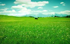

green - often refers to nature, new, optimisim and harmony. Also, it describes envy and jealousy.


orange - another energetic color that stands out and attract attention. The color signifies autumn and harvest as well.


purple - very prominent color that signifies royalty and wealth. Sometimes they represent other things such as death, imagination and romance.


white - often described as the color of purity, perfection, and peace. (One of the reasons why the color is used in Western weddings and hospitals.) In contrary, Eastern cultures represent mourning, death and used for funerals.


black - usually suggests elegance, formality and authority and also death.


You can experiment with colors to create different combinations that will generate certain tones such as warm or cool or neutral.

Here are some popular palettes that will help you to start.


Here are couple of websites that allow you to experiment and create your own palettes.

adobe colour cc
https://color.adobe.com/

paletton
http://paletton.com/

colour scheme designer
http://colorschemedesigner.com/csd-3.5/


Now remember! These are only guidelines to help you to decide what color of prints or frames will go better with your place and its surrounding. Sometimes, taking a bold step will create an unique setting that is just right for you.

Once you have decided what to print or what to hang on the wall, visit www.canadaoncanvas.com to see your work come alive.

Thursday, April 21, 2016

Things to look out for before printing

When we think of printing, it sounds like the printer will do everything for you. But, there are couple of things to look out for or consider before printing to make sure the final results will meet your expectations.

1. Always check the resolution of an image before printing. 

DPI or Dots Per Inch is very critical to the quality of the prints. The term stands for how many dots are in one square inch, so higher dpi results clean and crisp image. If you try to print a low resolution image, it will look blurry or pixelated especially if you print it on a large scale.
http://www.phunkemedia.com/images/content/print-resolution-dpi-examples.png

2. Check the color mode of the image.

There are two types of color mode used when displaying an image.

1. RGB - RGB is a spectrum of colored lights - involving Red, Green and Blue - that is used on screens to display colors. RGB has much larger gamut than CMYK(ink) which can portray millions of colors that CMYK cannot produce. RGB colors are known as additive because the palette starts from black and as the colors are added the result is lighter with the white being the very end of the palette. So, if your work is to be presented on a screen, you should be working in RGB.

2. CMYK - CMYK is a spectrum of colored inks - involving Cyan, Magenta, Yellow, and Black - that is used in printing. CMYK has limited gamut compared to RGB. CMYK colors are known as subtractive because the palette starts from white and as the colors are added, the palette is gradually gets darker until it reaches black. Unlike RGB that is based on colored lights, the colors we see with inks are coming from their absorbing and reflecting certain wavelength of lights.
So, if you are going to print an image, it is best to change the mode into CMYK to have the best accuracy between what you see on the screen and what you see on the print.

http://cdn01.pelfusion.com/wp-content/uploads/2013/05/RGB-VS-CMYK.jpg

But hold on! Because you are planning to print an image, it shouldn't lead you to work in CMYK mode from the start. The reason is because CMYK has such limited color gamut, you will have to work within such small area, however, RGB has much larger gamut which can produce vibrant and strong colors which will let you to work in much larger spectrum. When you print, the drivers will convert from RGB to CMYK accordingly to match the colors as closest as possible. You can color proof if you are using Adobe products to see the printed version on the screen which will help you to decide on colors and how the printer will process the image.

https://blog.fotolia.com/us/files/2016/02/Confronto-Gamut-01-1024x1024.jpg


3. Consider the type of paper.

There are many types of papers for printing. Some are matte, glossy, or even textured. Depending on the paper, the presentation will have different effects. Also if you are printing at home, you should know the types of papers your printer can handle. If you try to force printing with a paper that the printer doesn't accept, the result may not be good or even break your printer. Well known printing brands such as Epson and Canon provide their own line of quality papers which allows easier production for those who are looking to print at home.


Other ways you can print is by sending your work to professional print studios as they will have proper equipments and professionals who will do everything for you. Consider visiting different studios and ask for color samples to find the perfect palette you are looking for because each studio may have different printing profiles which will have slight variations of colors.

If you are planning to take your work to a print studio, come over to www.canadaoncanvas.com as the studio offers great products in great quality.