There are many terms regarding colors, however, since we are in color theory 101, lets just take a look at the basic terms that are key to understand how color is used.
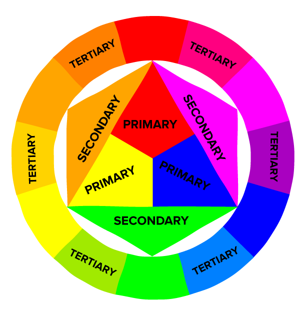 |
| http://cdn2.hubspot.net/hubfs/53/123b.png?t=1462568073767 |
primary colours - red, blue and yellow
secondary colours - second set of colors mixing 2 primary colors - green, purple and orange
tertiary colours - third set of colors mixing 1 primary color and 1 secondary color
hue - a pure color without any white or black
shade - a pure color mixed with black to produce darker color
tint - a pure color mixed with white to produce lighter color
tone/saturation - intensity of color - higher saturated color will be much vivid and stronger.
Once you have understood different properties of color, let's take a look at how each color is often described as, in other words, color psychology.
Colors describe certain feelings or characteristics which become a tool that advise the viewers how to approach and understand the subject.

red - powerful and strong color, often associated with meanings such as wild, power, strength, passion, danger, and anger.

blue - one of the most common colors in our lives which describes calmness, trust, peace, sadness, and intelligence.

yellow - energizing color as it is often associated with sun and light. Also it describes warmth and joy
green - often refers to nature, new, optimisim and harmony. Also, it describes envy and jealousy.

orange - another energetic color that stands out and attract attention. The color signifies autumn and harvest as well.

purple - very prominent color that signifies royalty and wealth. Sometimes they represent other things such as death, imagination and romance.

white - often described as the color of purity, perfection, and peace. (One of the reasons why the color is used in Western weddings and hospitals.) In contrary, Eastern cultures represent mourning, death and used for funerals.

black - usually suggests elegance, formality and authority and also death.
You can experiment with colors to create different combinations that will generate certain tones such as warm or cool or neutral.
Here are some popular palettes that will help you to start.

Here are couple of websites that allow you to experiment and create your own palettes.
adobe colour cc
https://color.adobe.com/
paletton
http://paletton.com/
colour scheme designer
http://colorschemedesigner.com/csd-3.5/
Now remember! These are only guidelines to help you to decide what color of prints or frames will go better with your place and its surrounding. Sometimes, taking a bold step will create an unique setting that is just right for you.
Once you have decided what to print or what to hang on the wall, visit www.canadaoncanvas.com to see your work come alive.
No comments:
Post a Comment